

The Go-Go Flows and Stagflation
The Go-Go Flows and Stagflation
Flows and Exxon covered in-depth. Russia = inflation shock.

The BofA sentiment indicator has fallen to 3.4 from 3.9. For long-term investors, a reading between 1.5 and 4.5 is a contrarian buy indicator. Risk, volatility, and forward returns are historically elevated at these levels.

A Quick Summary of Flows
For the impatient among us, here’s a quick and dirty rundown of the key highlights I’ll cover in this issue:
$46.3 went to cash (most since mid January), $1.9bn to gold, $5bn from equities (first outflow in 10 weeks), $10.6 to bonds.
Biggest outflow from Emerging market bonds since Mar’21 $3.1bn $EMB
Largest MBS outflow since Mar’20 $1.6bn - (taper front-run?) $VMBS $MBB
Biggest outflow ever from European equities $6.7bn $VGK $FEZ $EZU
Biggest outflow ever from financials $3.5bn $XLF
Largest REIT outflows since May’20 $1.1bn $XLRE
Largest Energy inflow since Mar’21 $2.4bn $XLE
Largest inflow ever to materials $4.1bn $XLB
Past and Present? 1973-1974
Performance by asset through ‘73/’74, Oil & War Shock/Stagflation Regime

The oil shock of 1973 and the Yom Kippur War hit equities hard, with only commodities out-performing inflation. The #SPX had a -40% drawdown-from-peak.
Tech, consumer discretionary, banks, and small caps got hammered in the 70’s. The Fed engaged in tightening but oil prices did not reverse course, but remained at structurally elevated levels despite hostilities cooling off.
The bear market/recession only ended when the Fed reversed course, after slashing the Fed funds rate to 3% (from 14%).
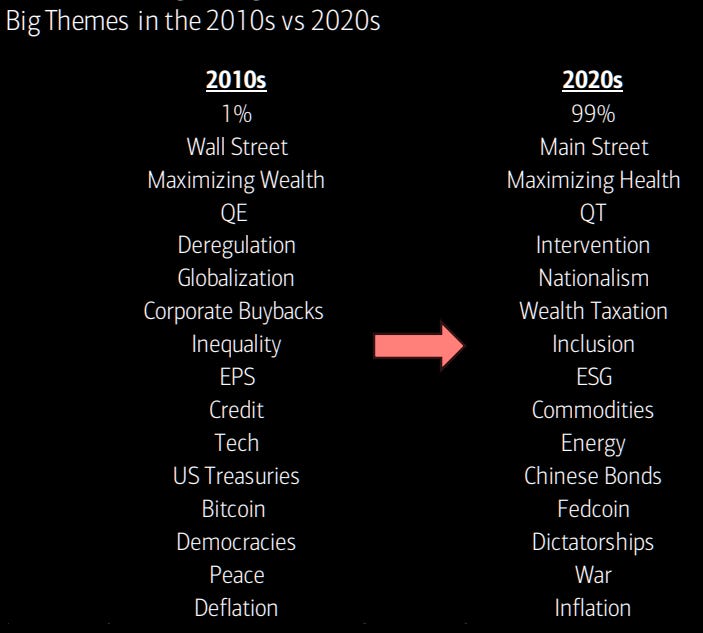
What about 2022? We have a Russian war in Ukraine and peak inequality in the US (and worsening) off negative wage growth. More countries are adopting isolationist postures toward the global economy, and intervention is rising. We’ve seen less confidence in global financial systems, with more sanctions, confiscations, and tariffs. If history rhymes, this could mean a new era of inflationary boom/bust cyclicality.
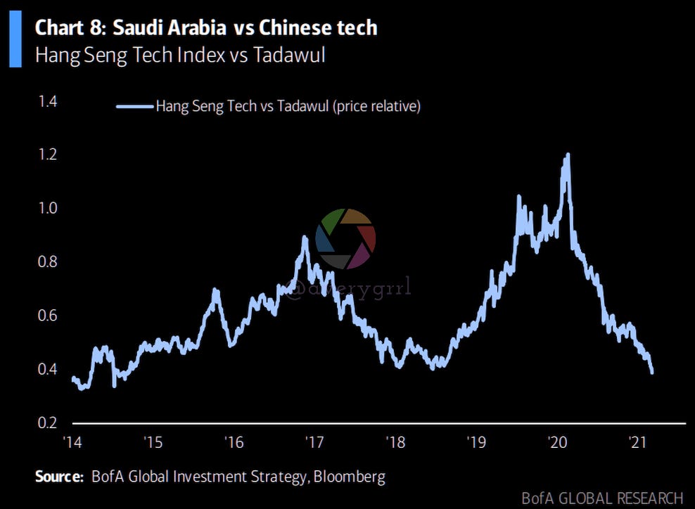
We’ve had a reversal in inflationary vs. deflationary assets, commodities vs bonds, Saudi vs. Chinese tech, and value vs growth.
Major themes of the 2010’s vs 2020’s:
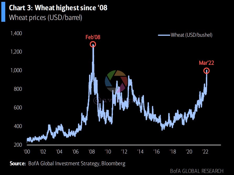
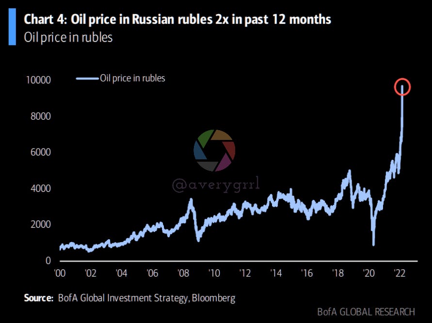
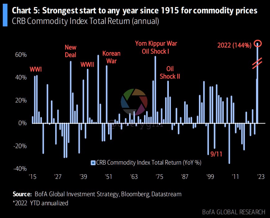
Euro producer prices were up 30.6% YoY… pre-invasion. Commodity prices are soaring. Where have we seen this before? 1915? It doesn’t even fit on the chart.
The 1970’s: Misleading or Bellwether?
The 1970’s may provide an easier analogue. However, the macroeconomic environment has shifted so drastically, and the Labor/Capital line doesn’t even look like the same planet anymore. As such, I expect workers/labor to suffer more in 2022. As corporations notched record profit after record profit, there’s still talk about “recovery”, and the Fed hasn’t even tapered or raised rates. The government hasn’t passed a single bill in favor of tax-paying citizens in recent memory. Without getting too political here, it’s a bit silly, as politicians are supposed to represent us, the taxpayer. Since 2010, they’ve represented concentrated money and corporate interests instead.
All in all, I find this… Kind of ridiculous? Personally, I’d like corporate America to give me a refund. A $20k check would be quite nice, and more in-line with what corporations are receiving, compared to the $600/$1200 hand-outs from the treasury. Anyway, let’s just remember that the government’s outlay on social programs is minimal, as are taxes on corporations. This sits in stark contrast to the 1970’s, and I find the two regimes difficult to compare, despite sharing many similarities in capital markets. Society, taxation, regulation, and governance have all changed dramatically.
With that in mind, let’s take a look at the 1970’s. I do worry that this is a scare tactic. Wall Street’s media arm seems to exist for the sole purpose of manipulating individual investors. Expect a lot of fear, uncertainty, and doubt. Try to remain optimistic and certain that you will stick to your plan!
Cutting to the Chase: A look at the 70’s
So… what happened AFTER oil peaked in the 70’s? Commodities can’t keep rising forever like equities.
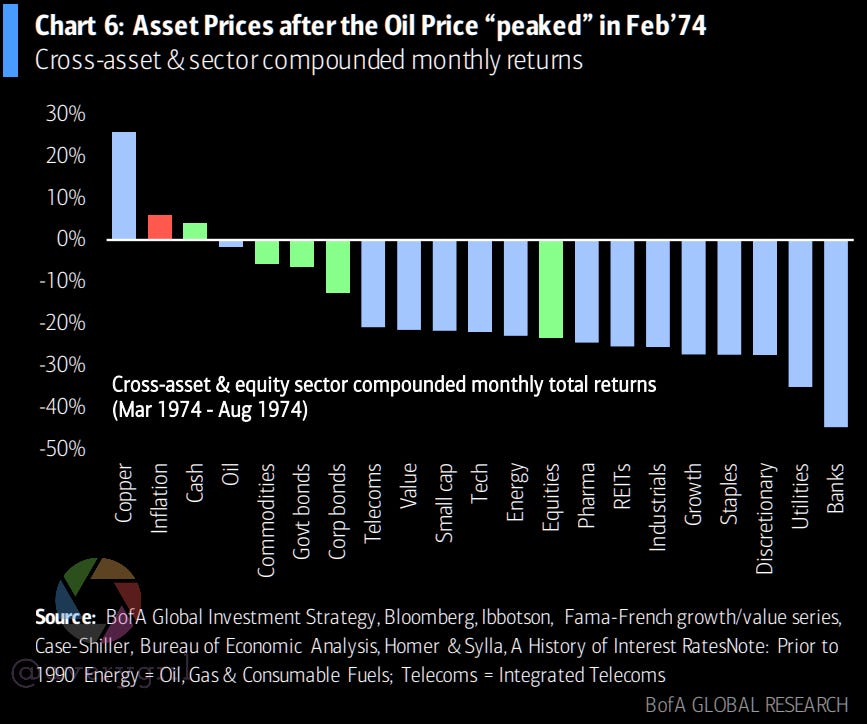
Yeah… COPPER did fine. Everything else did awfully. Banks and utilities got obliterated. Cash performed better than bonds and equities. This is pretty rare.
My Thoughts
When I look at the 70’s, I see the inflation and the hit to equities. But I also see something else. This is one of the times when boomers (and their parents) were able to accumulate massive amounts of FUTURE wealth. Equities traded at cut-rate prices. Investing in ‘73-’74 was, arguably, one of the best times to invest for the future.
Investing for the short-term? Not so great! The problem is always the same: nobody knows where the bottom is. Nobody knows when the market will start ramping. Nobody knows if that ramp is a false bottom. I’ll always advocate for staying in the market and repeatedly buying.

That’s a ridiculously scary chart… but the general direction is “up”. One of the easiest and most-damaging errors an investor can make is to suddenly go to cash. Staying invested and optimistic is the only reality-based approach to bear markets.
This too shall pass. I don’t know how it will, I just know that it will. Never bet against America. We always find a way…. and we usually find a way to make it out ahead of other nations. The US is, by any measure, an unrivalled force in global capitalism, and home to the most-powerful and valuable corporations with the highest profit margins and most stable business models.
Over any 30-year period, equities have always beaten inflation. Bonds have not done so. We’re not even in a bear market here. We could get there, but I don’t think anybody truly knows.
Return Landscape: Flashback to the 1970’s
Each week I’ve been sharing a relevant “asset return swatch”, to help visualize what performed well under prior or current economic cycles. For the period of 1965-1979, which started off with the “Go-Go Years”, awful glamour stocks/tech led in ‘65-’67. I wonder who’s left. $IBM?

A truly incredibly book. The first “real wall street” drama written contemporaneously. Before “Wall Street” (1987) or “The Big Short” (2010), there was “The Go-Go Years” by John Brooks. Guess who wrote the forward? The same man who wrote “The Big Short” and “Liar’s Poker”, Michael Lewis.
Of note: nearly every asset class was outpaced by inflation from 1973-1979. What did well? Nothing. Energy did alright, I guess. This was one of the rare times where the S&P 500 wasn’t from Lake Woebegone, and was merely average, rather than above-average. (The #SPX almost always returns a bit more than the average asset class. Heading into the 1980s, the #SPX went on to smash every single one of the listed asset classes here.)

“Does this mean I should buy *points at a box* this thing here?”
“Uhh.. what? No.”
Seriously, this is for educational purposes. Sector compositions were wildly different in the 70’s and with the exception of bonds/inflation, basically every sector has undergone seismic shifts.
As of August 2020, the #SPX sector/sub-industry breakdown went something like this:

As shared on Twitter yesterday, the composition of the US market has changed considerably over time. You can see the entire visualization below. (If tech looks small, it’s because $AMZN $GOOG and $FB aren’t considered “information technology”.)

You probably will need to zoom this one and pan around, but I guarantee you, it’s quite interesting.
What I’m Seeing/Hearing
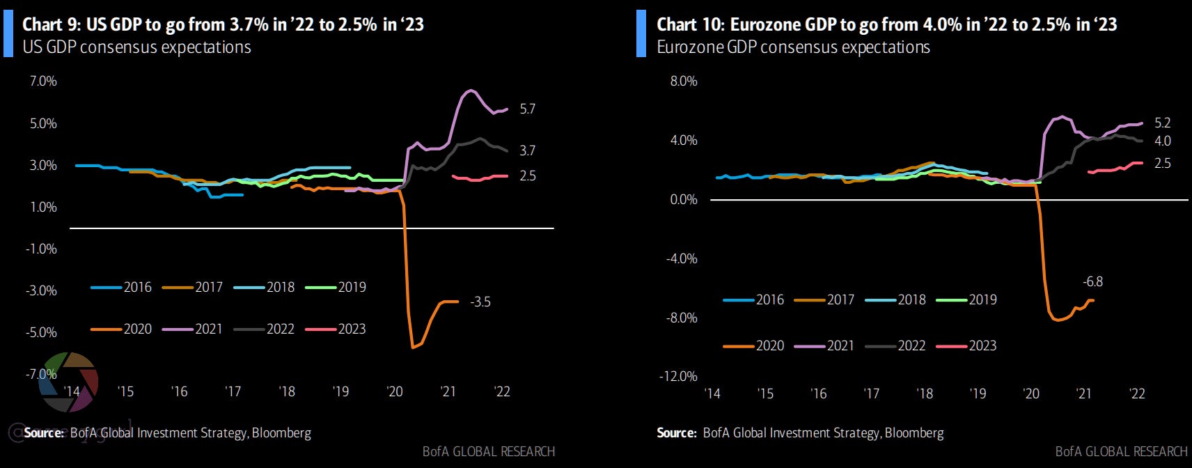
Sentiment has shifted in favor of US equities following the Russian invasion. GDP estimates show a consensus contraction in the US from 3.7% to 2.5% in 2023. In Europe, a much steeper decline to 2.5% from 4%.
Everyone seems to be bearish.
Weakness in lead indicators of the end-of-QE bear market past 12 months
Can’t catch a bid: EM debt/Chinese credit, Chinese tech, biotech, despite lower yields. This can indicate early liquidation or an anticipation of geopolitical dislocation to financial and FX reserves.

Credit spreads are widening, volatility is heightened, and conviction in “2022 longs” is evaporating, such as banks. $JPM lost nearly all of their gains from the past two years this week.
Hope is Not Lost
EPS estimates were 8.3% for the US and 4.7% in Europe. Looking forward to 2023, while we could see some moderation in estimates, things don’t yet look to be in poor condition.
In fact, US-domiciled corporations are on far better footing than they were in the 1970’s, and I think this has been missed by many analysts. Flows would seem to indicate sentiment is blowing this way already.

The 1970’s had wide-ranging social programs, an incompetent and handcuffed Fed, and US corporations had to answer to the public. This has changed over the past 50 years, and corporations have nearly no responsibilities to the republic, minimal taxes, regulations and oversight are virtually non-existent, and the markets seem oversold.
Flows
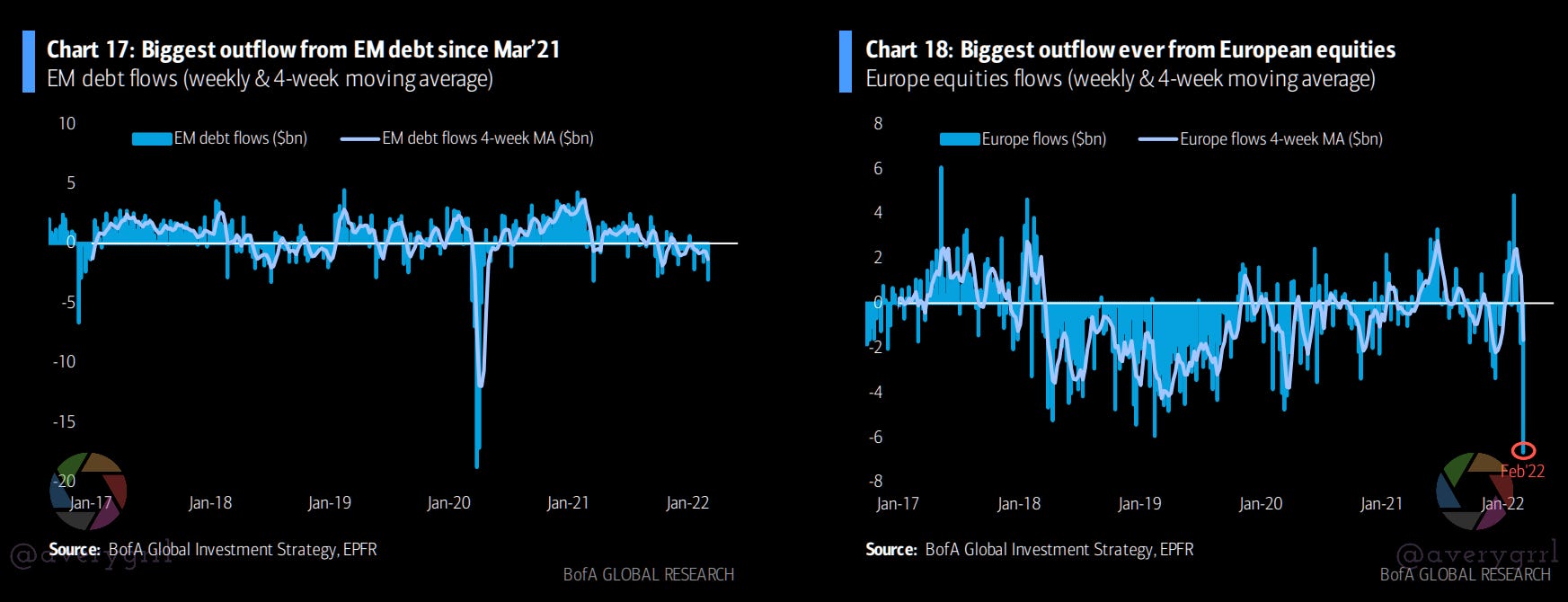
As mentioned earlier, we saw the biggest outflow from EM debt since March ‘21 and the biggest outflow EVER from European equities.
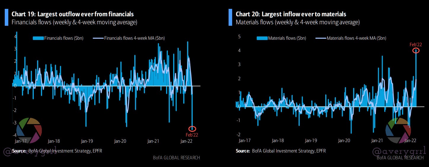
Financials had their largest ever outflow, while Materials had their largest ever inflow.
BofA Private Client flows: Bank loans, IG, growth leading
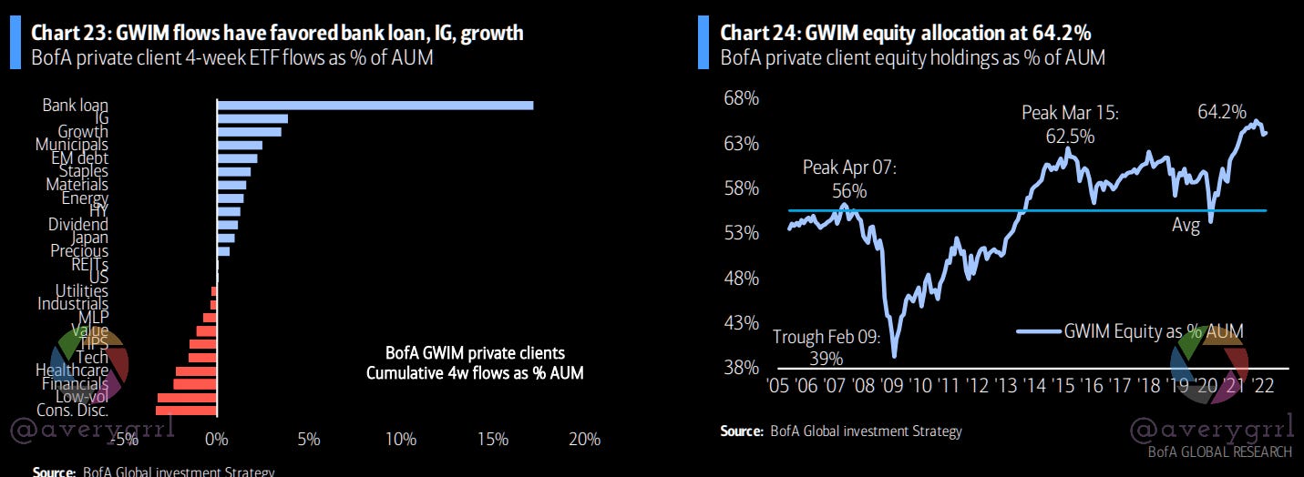
After loans/IG/growth: munis, EM debt, staples, materials, and energy saw the highest ETF flows as % of AUM from GWIM clients. Equity allocation stands at 64.2%.

BofA private clients are holding an average 17.3% allocation to debt, and 11.7% in cash, both below the LT average, although cash has picked up in January and February.
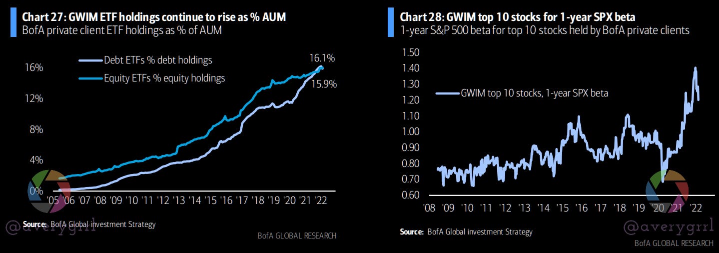
ETF holdings have continued to rise as a % of AUM for BofA private clients. Only 16% in ETFs? Glad I’m not a BofA client, their returns must be absolutely atrocious.
But I digress… This is hilarious on the face of it. Look at the chart on the right, above. Do BofA private clients have enough beta in their portfolios with their top-10 holdings? What on earth are they even holding? I really don’t want to know. Probably $LCID and other weird boomer memestocks. Yeah, I said it. BofA private clients aren’t very bright. They do have a lot of money, though.
Weekly Equity Flow Summary
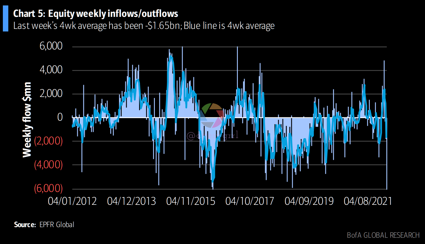
Equity funds also suffered their largest weekly outflow on record, based on data going back to 2004, as geopolitical risk scared investors out of their holdings.
Global EM debt funds had their worst weekly outflow in 51 weeks. Commodity funds had strong inflows and have gained 2.5% in AUM YTD.
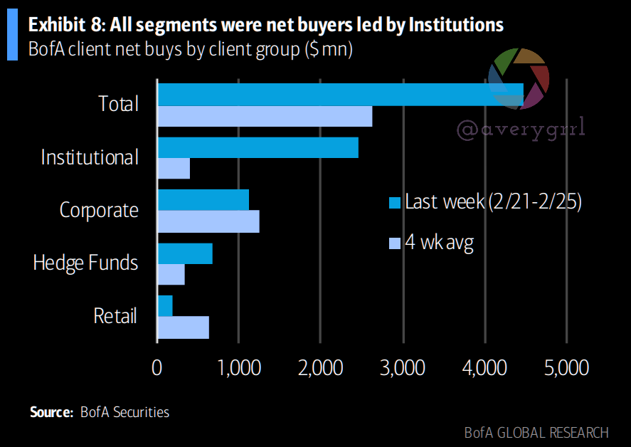
ICYMI: HFs and Institutions Bought The Dip
The #SPX had a volatile couple of weeks.
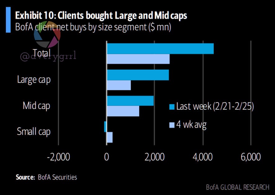
For the week of 2/21-2/25, BofA saw aggressive dip-buying in equity client flow trends. It’s worth noting that all three groups: Institutional, Hedge Funds, and Private Clients were all buyers, led by institutions (who were net sellers all year).

Small caps were sold (first time in nine weeks), and large caps were bought (first time in three weeks).
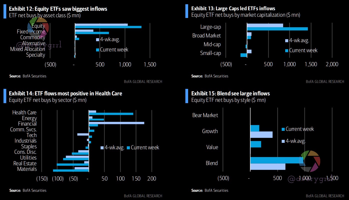
ETF flows have looked “healthy”. Healthcare had it’s best week for inflows at the end of February, too. (Week of 2/25 here, still).
Corporate buybacks accelerated relative to the prior week but were the second-lowest of any week YTD. Cumulative corporate buybacks amounted to 0.05% of the S&P’s market cap, and are tracking above 2021 levels (0.03%), but below 2019 levels (0.06%) for this part of the year.
Last week, I went in-depth on Equity and FI flows for the week of 2/25, as it was the first time in 2022 that we saw HFs and Institutions buying instead of selling. I believe this marks a “sea change”. While we can’t see “the bottom”, HF and institutional buying could help set a “floor” of sorts for equities.
Read more here:

2022 Returns
So, what about this year? Well, most everything is down except for energy and commodities.
Here’s how it stands, with Russian equities down -60% as of March 2nd:

”The Overbought & Oversold”: Ranked deviations from 200dma in USD:

Fixed Income Flows: A Deep Dive
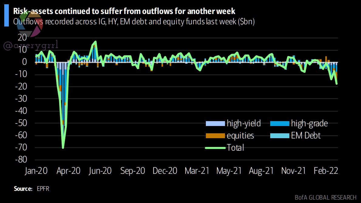
Risk assets have remained under pressure as geopolitical risks rise. For IG, HY, and EM debt/equity funds, outflows are going through their worst period since March 2020.
Outflows were initially caused by CB-related uncertainty, but risk-assets flow trends have been pushed deeper into negative territory as geopolitical tensions escalate.
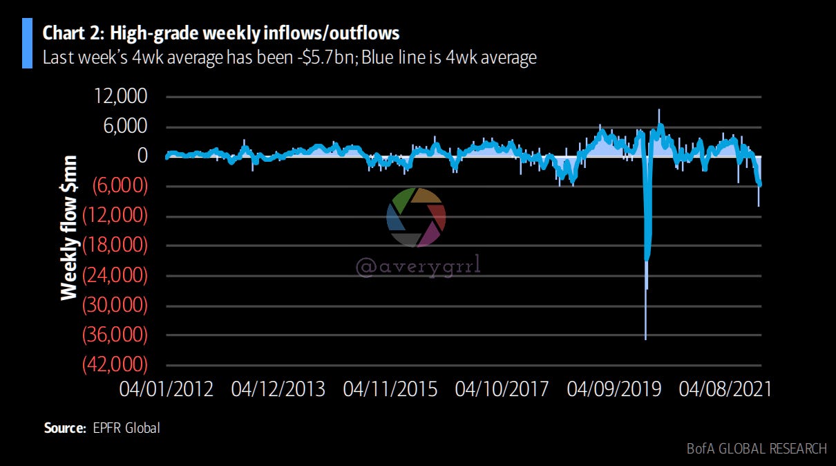
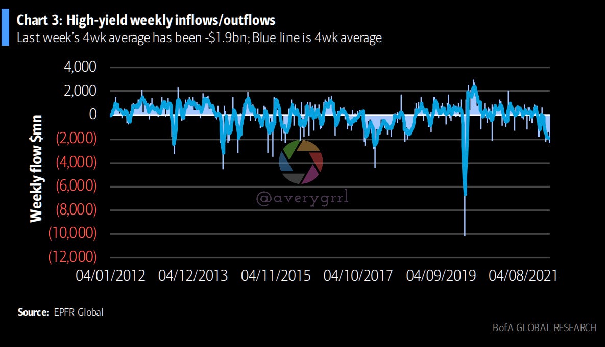
Over the past week, high-grade funds suffered a seventh weekly outflow in a row. High-yield funds suffered another outflow last week, the largest since March 2020.
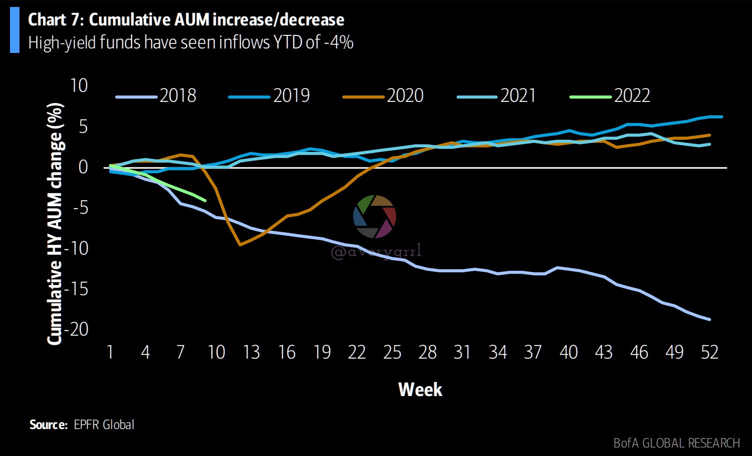
High-yield funds have seen 4% outflows YTD.
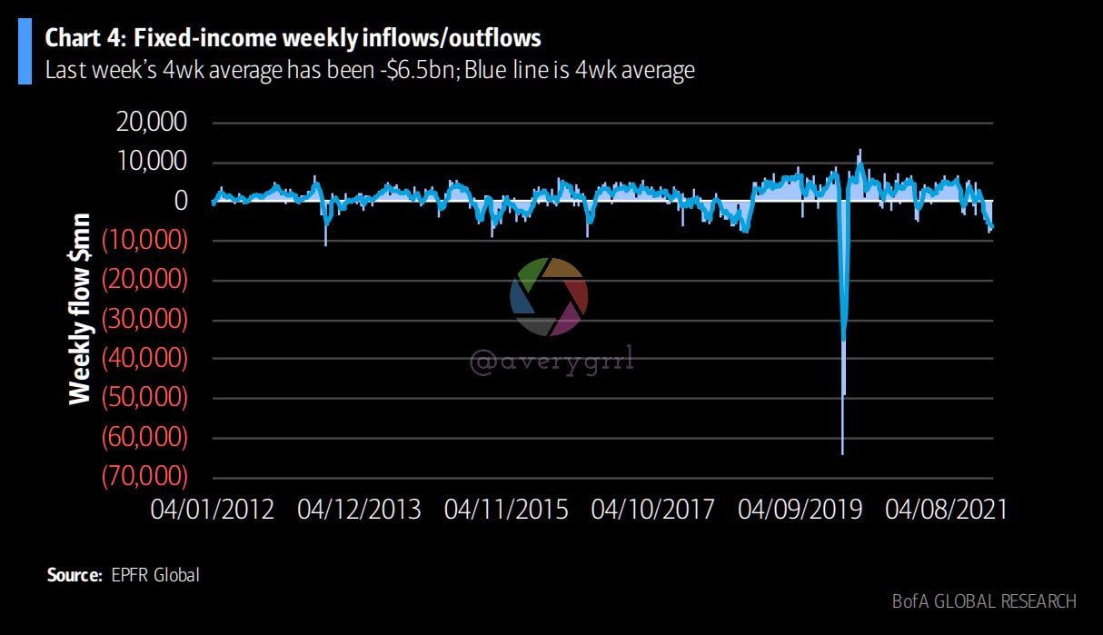
High-yield ETFs also had their biggest weekly outflow in a year. Last week’s 4-week average was -$1.9bn. The blue line represents the 4-week average.
High-yield monthly inflows/outflows, 2010-2022 with quarterly average (blue line).

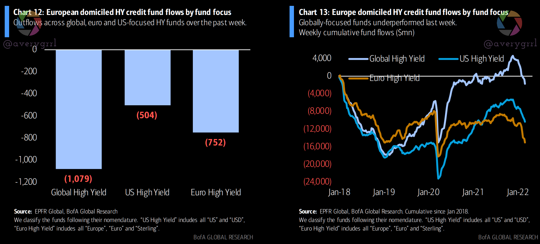
A breakdown of HY funds by US/Euro/Global regions shows each getting hit by outflows, with the latter underperforming.
Government bond funds saw an inflow as FI investors sought safety. Money market funds recorded an outflow, which makes 7 of 9 weeks this year for MM outflows.
As a whole, fixed income funds had their eighth consecutive weekly outflow, and are currently experiencing the worst start to any year since 2009.
4% of AUM has fled high-yield funds in 2022, almost as bad as 2018.

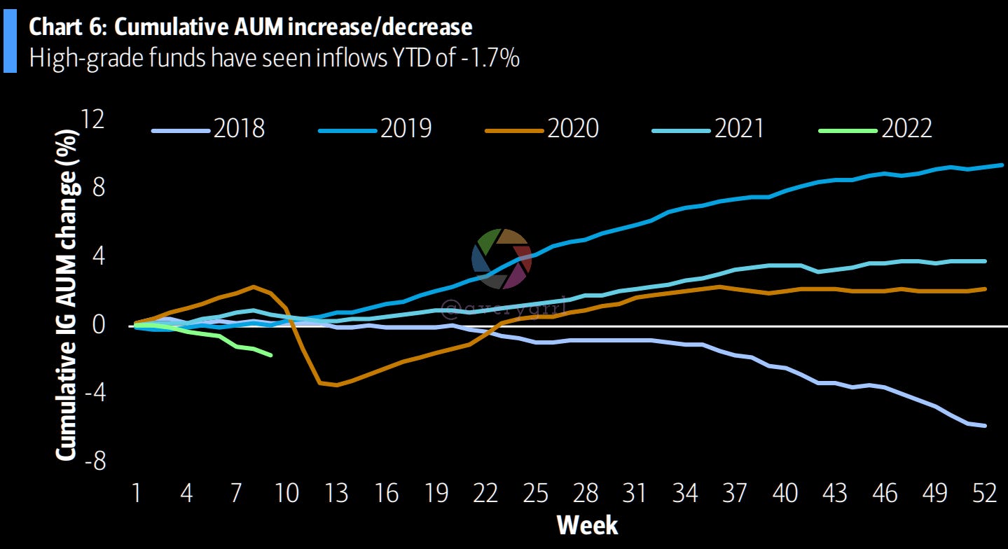
1.7% of AUM has left high-grade funds over the first nine weeks of 2022.
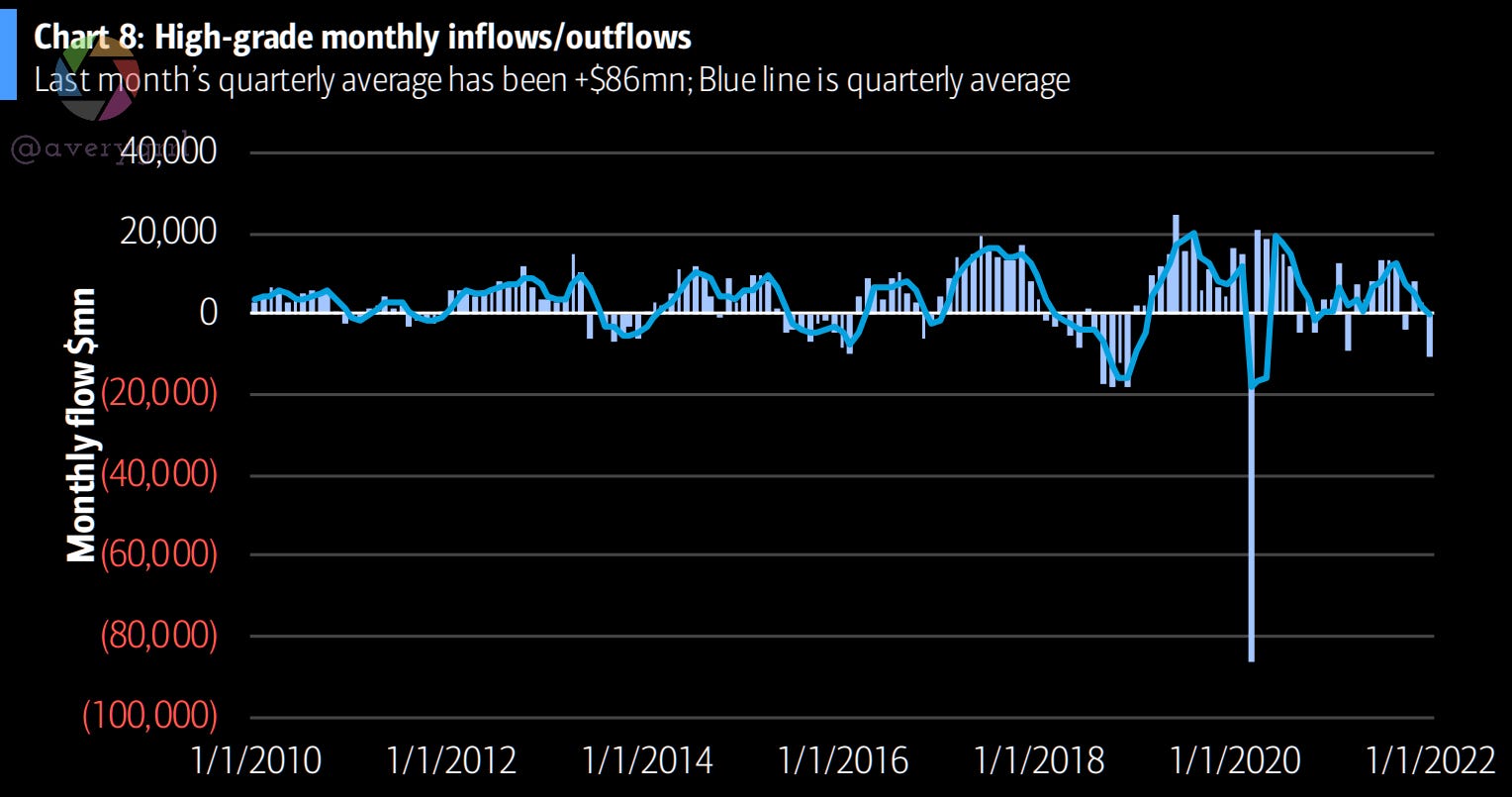
High-grade monthly inflows/outflows w/ quarterly average (blue line).
FI outflows steepened.
I’ve been recommending exposure to energy, as well as metals/miners for a few weeks. As many have seen, returns since then have been astronomical. As of yesterday, it seems some of FinTwit has finally noticed… I just worry they’re a bit late to the show.
On March 1st, I wanted to highlight $CVX, which you can see here if you’d like:


On March 2nd, I wanted to shine a light on $COP, another large US oil major.


I’m currently holding some energy funds, but have already begun scaling back my exposure, especially direct exposure, and using energy equity funds and a diversified basket of commodities ($VDE and $PDBC).
While it’s been a few weeks since I first posted it, I posted an updated “Global Capital Cycles” sample portfolio to share some ideas.


While this portfolio leans heavily on $VGPMX and $VGELX from Vanguard, or $FFGCX and $FSENX, as well as a dash of $XME, it is possible to create a similar portfolio using ETFs if you’d like. These are risky and volatile asset classes, and are not suited for long-term investors, but is a valid way to lean into global capital cycles. Vanguard now has a fund named after this concept.
$VGPMX hasn’t delivered much return in the past, but in 2022, it’s one of Vanguard’s best-performing funds, along with their energy funds.
Fidelity’s $FSENX and $FFGCX are also up 10-25% this year, but have much higher expense ratios and the holdings are not quite as fitting as Vanguard’s. I will always recommend Vanguard first.
What about Exxon? $XOM Analysis/DD
I wanted to take a deeper look at Exxon $XOM, as I’ve already touched on Chevron $CVX and Conoco-Philips $COP recently. So, here we go.
Exxon has had free cashflow growth of 5x, which differentiates it from peers. $XOM telegraphed their outlook in Dec ‘21, its 2022 strategy update filled in some gaps on critical milestones that underline confidence in topline cashflow and FCF growth that sets $XOM apart from industry peers.
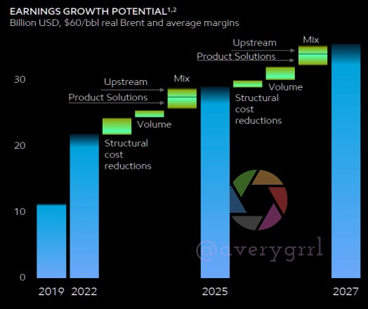
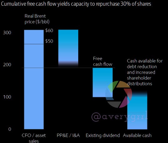
$XOM’s base case assumes that at flat $60 Brent, it can generate excess free cash of over $100bn between 2022-2027. At current strip prices this is significantly higher. Management is treading carefully on affirming use of cash, but stepping up cash return to shareholders is looking increasingly like a question of when not if.
Exxon has capacity to buy back 30% of its current market capitalization over its plan period to 2027. I expect Exxon to reach $105+.

In 2016, Exxon’s functional structure featured nine companies. In 2022, they’ve simplified, using a “solution-led structure”. Now there’s only three! Whoa!
Buoyed by a strong suite of projects well on their way to development, a potential increase in valuations by offsetting increased activity is material.

$XOM’s project queue is quite good, and their work in Guyana seems to be their best shot, but CV19 has tempered management’s outlook, along with third-party execution issues (Chevron Tengiz, Gorgon).
I’d consider it likely that $XOM’s gross production capacity reaches 1.2 to 1.25mm bpd within 5 years; (gross) production included in its planning assumption classify Guyana at “more than 850,000bpd”. The difference is the potential declines on earlier development phases. The scale of the resource appears to be well over 10bn boe, holding production essentially flat for an extended prior, based on disclosures from $XOM’s 30% partner, Hess. See below.
Guyana: 1.25mm bpd of capacity (growth extends beyond 2027, to 10 boats)
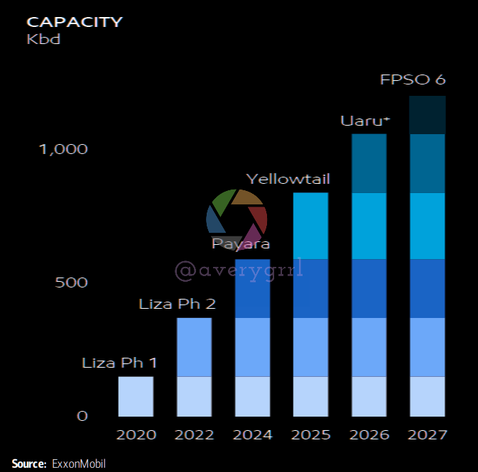
However, “greater than 850,000bpd” seems to be a conservative estimate compared with 1.25mm bpd of capacity. I think Exxon’s guidance has been cautious and conservative, with production outlooks of 4.2mm boepd (or a 2% growth rate from 2019, assuming 230k boepd of asset sales that has upside with its proposed exit from Sakhalin.)

BofA agrees:

I think Exxon is getting better and better. FCF capacity is expanding faster than peers (5x over six years is amazing). Share buybacks could amplify per-share impacts, and absolute expansions in FCF is one of my favorite definitions of value. XOM’s portfolio outlook seems materially undervalued at current strip prices.
DCF analysis on $XOM: $110?
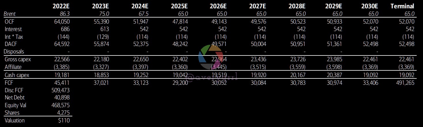
Earnings changed reflect updated mgmt guidance:

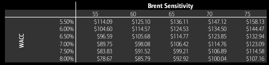
So, based on $65 brent and $61.50 WTI long-term, $3 Henry Hub NG, then $110 per share is possible, with $105 seeming like a conservative outlook. This includes a WACC of 6.8%, based on risk premium and 2-year weekly beta.
Risks include oil and gas price and margin environment, significant delays to new upstream projects which are critical to $XOM’s growth prospects, and an inability to capture the price movement due to cost pressures (OPEX, CAPEX, and taxation). Upside risks would include higher prices for oil and gas than assumed above.
This is just my opinion though, and I might be wrong. You’ll have to pay a financial analyst to get any sort of certification on research. Sorry!
Wrapping Things Up
In summary, the market is looking a bit weak, but an uplift from HF/institutional inflows could be changing the tide and equities may be finding a bottom. Flows haven’t been supportive ex-US yet, and with Russia on the warpath, we’ll need to wait and see how EM/DM markets are impacted. It’s quite possible that recent outflows from DM/EM have been an overreaction, if not in the short-term, then certainly in the long-run, as DM trades at a very steep discount to US equities, which still remain expensive vs. the rest of the world.
Last night, as a thought experiment, I wondered: “where would the #SPX be *without free trading*”. By best estimate was somewhere around 3600-3800, assuming a 5-6% YoY growth for the #SPX without any free trading.
In short, I highly doubt the #SPX will go below 4000, and only with a heavy amount of short pressure and a domino effect in complications stemming from the war in Ukraine.
When the market sell off in a “bad way”, I have deposits ready to go, and have been a net buyer of equities all year. This won’t change, even if the #SPX keeps dropping. In fact, I’ll probably take out a small personal loan or a 0% APY credit card to ensure I’m able to buy as much equity on the cheap as I can. This is where wealth is accumulated at a discount, and why I recommend weekly/bi-weekly and automated buying of a diversified portfolio of mutual funds.
Thanks to everybody who gave suggestions on Twitter for subject for me to cover, and I’ll see what I can put together going forward to answer more questions or cover more ground.
I hope you’ve enjoyed all the pretty charts and the $XOM deep dive.
Wishing you and your loved ones a safe and happy weekend!
—Avery
P.S. In case you missed it, Goldman’s Exchanges Podcast had some interesting thoughts on the effects of the Russian war in Ukraine on the global economy and markets.
gr8 post